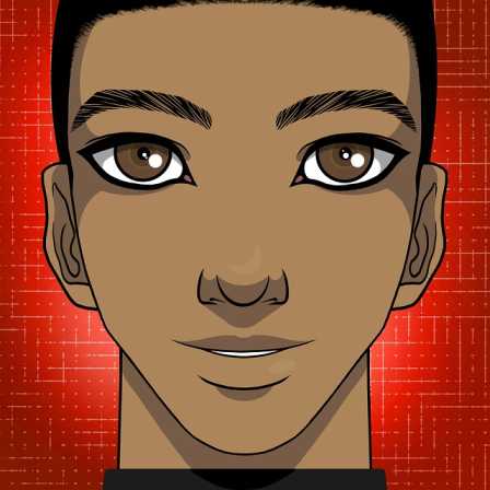
Avatar
Avatar is used to display an icon of particular person or character.Monad UI has different types of Avatar
Avatar Small
Avatar Medium
Avatar Large
Avatar Extra Large
Avatar
Avatar rounded is the avatar in the shape of circle.
Avatar Rounded Small
Avatar Rounded Medium
Avatar Rounded Large
Avatar Rounded Extra Large
Alert
Alert is used to display the message to the user. It can be used for success warning, error etc.
Alert Error
 There was an error processing your request
Alert success
 Data uploaded to the server. Fire on!
Alert Info
 Seems your account is about expire, upgrade now
Alert warning
 ---- is going live on August 30th. Get ready!
Alert Composition
Application submitted!
Thanks for submitting your application. Our team will get back to you soon.
Badge
Badge is used to display the notification or status.
Badge on icons
 7
7
 11
101
11
101
Badge on Avatars
7
11
101
101
Button
Button is used for different different tasks such as clicking on an event or submitting a form
Button primary and Success
Button with icon
Button float
Card's
Cards can be used to display about any product information Monad UI had 6 types of card display
Card vertical

Boat & the River
by Shreyash Mahajan
When boat does not know where to go it just floats with the flow of the river.

Card vertical with shadow
Boat & the River
by Shreyash Mahajan
When boat does not know where to go it just floats with the flow of the river.
Card with badges on icon

Boat & the River
by Shreyash Mahajan
When boat does not know where to go it just floats with the flow of the river.
 10
10
 10
10
 10
10
Card with text over images
Boat & the River
by Shreyash Mahajan
When boat does not know where to go it just floats with the flow of the river.
Card Horizontal

Boat & the River
When boat does not know where to go, it just floats with the flow of the river.
Card without images
Boat & the River
by Shreyash Mahajan
When boat does not know where to go it just floats with the flow of the river.
Input Fields
Input fields are used to take input from the user. There are so many types of input fields in Monad UI
Responsive Input fields
Inline and Input error style
Responsive Images
Responsive images means it adjust with the change in size of browser.
Image simple

Image rounded

Toast
Toast is a popup which is used to give message. There can be
Toast
Text utilities
There are three types of heading in Monad UI.
Simple Heading
This is Heading
This is Heading
This is Heading
This is Heading
Gray Heading
This is Heading
This is Heading
This is Heading
This is Heading
Simple Heading
This is Heading
This is Heading
This is Heading
This is Heading
List
List is used to display a series of element. It can be used inside a sidebar also
List simple
- Item 1
- Item 1
- Item 1
- Item 1
List stacked
- Item 1
- Item 1
- Item 1
- Item 1
Modal
Modal component can be used as a dialog. dialog can be of various types such as delete, save, cancel actions.
Modal
Rating
Rating is used to show the graphical representation of user rating. It can be used in ecommerce.
Rating


Grid
Grid is can be used to divide the page into portion of different layout. In monad UI we have two layout